Thursday, December 02, 2010

Evaluation Question Four : What have you learned from your audience feedback? ★

We asked people some questions when our video was half done to see if there was anything they especially liked or disliked about it before we'd finished.

Here are their responses:

Good Things:

- The story was easy to follow

- There were good transitions and liked the fades in/out and the speeding up

- The rain on the camera lens added dramatic effect

-Felt empathy with the character throughout the narrative

-Liked the shots of the guitar

Improvements:

- Some footage was shaky

-You could faintly see the reflection of us filming in the guitar

-The phone shouldn't have been turned towards the camera

Here is a video of our audience feedback about our finished music video.

Afterwards we asked some more people what they thought of the finished video and here are their responses:

Good things:

- Story line was easy to understand

- The match on action shots were effective

- The action matched the pace of the song

- There was good framing and the fades in/out were also successful

Improvements:

- There were some wobbles

We got some people to watch the music video and look at our final print products to see if they thought the were cohesive. Here are our questions:

What's good about the music video and ancillary texts?

- Looks professional, good layout and structure of the poster

- Simple but effective CD cover and inserts

- Visually interesting because of the effects like the stamp effect on the guitar and it looks like they're in a boat which links to the band name

What could be different?

- The background could be more eye-catching

-The colours could be more emphatic but it works as it is

-Capital letter for "November" on the advert

Are the products synergistic?

- Cohesive fonts

- The guitar has been used in the CD cover, and insert and on the advert because it's featured in the music video

- Constant theme

- The photo was used in the music video and on the advert and CD insert, like the guitar and clips of Olly from the video have also been used in these things

Can you tell what genre the music is from the CD cover and advert?

- Yes because of the guitar and the colours

- Conventional love song hinted at by the images that are pinned on the background of the advert such as the photo of a couple holding hands

From doing this audience feedback at different stages it has helped us make decisions about our product before it's too late to change them which then makes the final product better for the target audience. Getting constructive criticism at the end of the project is also good because it shows you what you can improve for next time and makes you notice things about your work that you might not have done before because you were working so closely with it for so long.

Getting good feedback is also important as it shows that the audience understood the project and that it met their needs and was successful in doing so.

Wednesday, December 01, 2010

Evaluation Question Three : How effective is the combination of your main product and ancillary texts? ★

Genre:

Our genre is a hybrid of acoustic and indie and this is known because of the concentration on the vocals and also the guitar and these are conventional of this type of genre. Within our music video, CD cover and advert we included the main iconography of this genre - the guitar on the back of the CD cover and also on the advert and we also chose to have the colours scheme blue as this connotes relaxation and feelings which the songs may be about and by doing this we have adhered conventions.

Institution:

Two in a Boat are acoustic/indie but are also quite mainstream but a company like Sony or Universal are too big as they only stick to the most popular genres and music they know will sell. Sony does have a sub label called Phonogenic which could be appropriate for Two in a Boat as it's independent but still linked to a mainstream company.

Ideology:

The music video and CD cover/inserts have a dominant ideology which is the Implied Behavioural Normalcy in Maslow's Hierarchy of Needs, where people have the need to 'belong' and this was clearly shown in our music video through the relationship of Ana and Olly.

Representation:

In the music video we represent both genders, however Olly is the one that has done something wrong and therefore has to apologise whereas Ana is the innocent character who winds up back with the boy because she forgives him. Both Ana and Olly are between 17 and 19 years old and this is the age of the target audience which is why the video will be appealing to them as hopefully they'll be able to relate to the issues in the video.
The heterosexual nature of Ana and Olly's relationship is clearly portrayed in the video and we chose this type of storyline because it would affect most people this way but even if some of the audience were in same sex relationship they can still relate to the issues dealt with in the video and i think this is the most important message.

Laura Mulvey, a feminist theorist has two main modes - either Voyeuristic (seeing women as 'whores') or fetishistic (seeing women as 'Madonnas'). In our music video neither of these theories have been applied as we wanted to have as equal an relationship as possible. This was shown in the music video but also in the CD cover, inserts and the advert through the images of the couple together but also having one of each of them alone so that none has more empathy than the other.

The combination of our music video and ancillary texts have worked well together as a constant atmosphere has been maintained and are clearly synergistic. The main symbols of our video are the guitar which has been used on the back cover on an insert and on the advert. The colour of the CD cover and inserts create a constant theme which is the same in the video too.

Friday, November 26, 2010

Complete Music Video ★


This is our finished music video of Ain't That Easy by Two in a Boat.
We included match on action shots like when Ana was walking through the doors, panning for the view of the city, a variety of shots including long, mid and close-up as well as some experimental shots, like when we were filming Olly from different angles. We also used fades in and out and the speeding up of time.
Our inspiration from The Plain White T's video Hey There Delilah has influenced our decisions when filming and editing ours and we hope that this can be seen when watching it. Our target audience feedback was positive and we hope to have achieved a music video that Two in a Boat could use.

Tuesday, November 16, 2010

Wordle ★

This shows the important words i've used most on my blog :)


The Final Print Products ★

Here are our finished print products - the magazine advert, CD cover (front and back) and four inserts.


We used an image of wood for the background of this advert as we thought it represented the genre well because it has connotations of nature and boats and these were the images we wanted to create. We used photos of the instruments used in the band instead of having an image of the band as this was more generic, then we also chose three images from the music video which we thought portrayed the genre and narrative of the song to synergise with the advert as well.


This is our CD cover front and back. The front shows an image of Olly and Ana stood on a boat which denotes the name of the band "Two in a Boat" but also follows the narrative. We changed the colour of the image to a blue hue which was more generic and we put the title in the bottom right hand corner as it's in the audiences eyeline. The title is black so that it is visable but doesn't distract from the image.
The back cover has the same image of the wood as the advert but it's the other way round, we used the same image of the guitar as well but changed it in photoshop to a "stamp" which is more modern and fitted better with the colour scheme and the whistful fonts. We also included the web address so that fans could access more information about the band.


This is also the same wood image as the background for our first insert. We then placed Olly infront of this wood to make it look like he was leaning against it in a relaxed "lovelorn" way, which relates to the genre of the music and also the lyrics and narrative of the song. We put the names of the song in the insert as well, which is a conventional thing to do and they're in the same font as the writing on the front cover. We also included who played what instruments within Two in a Boat and also where the CD was produced, also following the conventions of CD covers.
The second insert shoes Ana and Olly holding hands, which also converges with the music video. We chose to have this image blurred as we felt the solid image was too harsh for the genre and wouldn't fit with the atmosphere of the other inserts and covers. The close-up of the hands is a symbolic representation of the narrative in the video and so this is then connoted through this image, even without hearing the song.


The third insert has an image of Olly playing the guitar in a close-up, cutting off his legs and head which then focuses the eye on the guitar which is the whole idea of the song. We also changed this to the same blue hue that was featured on the front cover as this was synergy between the two images and again, it represented the genre and narrative. We included the lyrics because with songs of this genre it's all about lyrics so we thought that people may want to see them written down so they could express their feelings of them to other people, perhaps through facebook or twitter status updates. The lyrics are in the same font used on the other inserts/covers and placed in a central allignment as this is a natural way for eyes to move down the page, and it also fits in with the relaxed, chilled ambience.

The fourth and final image is of Ana, at the start of the music video when she's crying. We changed this image to the "stamp" effect that the guitar on the front of the CD cover had as this tied the two images together and made the image more interesting and unique to look at. As it's cartoon-like it reminds me of the Juno film credits which feature images similar to this one, and the music in Juno is also similar to that of Two in a Boat, which links to similar target audiences. We also decided to make this image blue too which tied all the images together and made it feel like a proper complete print project.

Before and After Photos:

Before -------> After


To change this image we altered the contrast and brightness which made it stand out more and gave warmth to the photograph which is why we used it at the end of the music video to conclude the narrative in the traditional, archetypal "happily ever after" way.

Before -------> After


For this image we cropped the image with the magic wand tool in Photoshop and changed the colour to complement the background and also changed it to a stamp effect which fitted better with our acoustic genre and appealed more to our target audience as it looks like pop art.

Tuesday, November 09, 2010

Evaluation Question Two : How did you use media technologies in the construction and research, planning and evaluation stages? ★

Research and Planning:

In the research and planning stages we used website including YouTube for watching music videos and getting screen shots, Google for images of CD covers and adverts that may apply to our genre, Wikipedia for information about our genre and artists. We also used paint for putting the images in a format that Blogger would accept and Microsoft Word for creating pie charts of our audience research and for experimenting with an idea for our advert.

Construction:

During construction we used still cameras for taking pictures of us filming and also for images that we could use for our CD cover and advert. We used camcorders for filming our music video and we also took some screen shots of footage from these. iMovie was used to upload our footage and enabled us to edit and complete our video, we also used iTunes for uploading our song which we then imported to iMovie. We also used a Mac laptop which we used for playing the song when filming Olly so that he played in time to the actual track we're using. We also used photoshop for designing and making our CD cover and our advert.

Evaluation:

We used Blogger in the evaluation process for uploading peoples responses to our music video and we also used YouTube for putting our music video on the website so that we could get it on our blogs. We also filmed some of our audience feedback and uploaded this to YouTube as well so that this could also be added to our blogs. We also used iMovie for burning our music video to a disk.


Here some photos we took whilst filming... some are natural ones we took whilst other members of the group were filming and some were more staged for our CD cover and advert.

Filming:


We experimented with many different angles when filming Olly and these include high angle, low angle, shots from the side and extreme close-ups of the guitar or close-ups of Olly's face. All these angles gave a different perspective of the singer and the song and these will be used in a montage effect within the video. We had to re-film these scenes as we felt the background was distracting so we found a plain white room with a mirror which gave a much better effect.


Acting:

These are photos of our actors Ana and Jenny who play "the girl" and one of the girls friends. We had to change the storyboard slightly, so instead of the girl being in her room and tearing up a photograph she's in the toilets at school with a friend ripping up a letter than Olly had previously written. The first picture of the girls shows them hugging after Ana's ripped up the letter and the second shows Ana receiving the text from Olly saying sorry which the leads to her journey to find him. We also filmed a match on action of Ana coming out of the door of the toilets which we'll use in the video.

More photos from filming... and some screen shots :)
The first image shows Ana waiting to cross the road at one point in our video. The bus came at just the right time and so i chose this clip to put as a screen shot as it was coincidental that the bus was there but it was relevant to the scene and it this image especially has a good effect as the bus is blurry meaning you can see the background as well.
The second image is of Olly playing the guitar and i particularly like this view. We did have to re-film a few of these scenes because of background objects (the chairs in this picture) but if we use this one or one similar for the insert or advert we will photoshop a more appropriate background in.
The third image shows Ana crying in the toilet after ripping up the love letter. I thought this image was very prominent as an important part in this scene and gives a clear idea about the emotion in this part of the scene.

Monday, November 08, 2010

Evaluation Question One : In what ways does your media product use, develop or challenge forms and conventions of real media products? ★

How our video USED forms and conventions:

The song we chose is from a genre that is very based about love, and feelings rather than other outside issues such as drugs. We chose to keep our video based on a narrative as almost all videos of this genre are the same and we also wanted to include footage of the artist as our inspirational video Hey There Delilah did. Many other videos do this is as well, such as Colbie Caillat's Falling For You.
Our print products followed generic conventions with things such as the colour which was blue to represent relaxation but also the sadness that is also experienced in the video. The guitar was also featured heavily which conveys the genre of the music and is also a conventional thing to do on adverts and CD covers of this genre like David Ford did.


How our video CHALLENGED forms and conventions:

We challenged some forms and conventions of the CD advert by not having the background as an image of the band as we wanted to have a more 'indie' feel and include a few images from the video for synergy and to give the audience some idea about the video and it's themes.


In my research i looked at music videos of the same or similar genre to the song that my group chose. Our main video was Hey There Delilah by The Plan White T's which included a narrative and footage of the singer. For our video we hope to use and develop this idea and change it into our own creation. There were some effects that the band had, such as the split screen, that we would have liked to have used but our technology didn't have the right software. We overcame this problem by changing our storyboard slightly by having more jump shots between different action to make it seem like it was all happening at the same time. I don't think our music video challenges conventions of this genre's style as it has focus on the narrative and has quite a relaxed, laid-back feel to it which almost all videos of this genre are.


Postmodernism

At the end of our AS Level Media course we started Postmodernism and i created a powerpoint presentation with Ana about the hugely popular TV series, Glee. We discussed the characters and their personalities, the creation of the program, it's influences, it's humour, story lines and of course the music - all of which contribute to the whole issue of postmodernism.
Here are some screen shots from the presentation:


Our music video incorporates postmodern ideas by taking ideas from other music videos such as The Plain White T's and incorporates them into our own production. The idea of the narrative from the girls perspective and the fact that we have montage effects of the singer within our video was inspired by watching their Hey There Delilah video and so created this postmodern effect. We didn't want our video to be too postmodern as we thought that it might distract from the meaning of the song which is important in this genre as there aren't many other distractions to the singers voice.
Within each episode of Glee characters always sing about their feelings, especially in break-ups, as that is easier than talking face to face with someone and this happens in our video as Olly is seen singing about his feelings for Ana. In Glee there is sometimes a montage effect when someone is singing a solo which shows what they're singing about from past experiences or something relating to the song which is also what happens in our video as it shows Ana in between shots of Olly.

Friday, October 22, 2010

More Filming... ★

Today Mike and I filmed some more footage for the montage effect. We filmed boats and swans on the docks as scenery for things "the girl" could be passing on her way to meet Olly. We did some panning shots of the docks, looking out across from high land. We also walked with the camera as if it was through "the girls" eyes which had a good effect and could easily be added in between other footage. We also included some other shots including close-ups, extreme close-ups mid shots and long shots and we included some zooms, panning and POV angles.
We then uploaded it to the Mac and started editing by cutting the film when it changed shots as this made it easier to see what footage we actually had. We're filming more after half term with "the girl" and once this as been done we can start putting everything together. We're also going to take still photos for our CD cover, insert and advert which will synergise with our music video.

Thursday, October 21, 2010

CD Cover Ideas ★

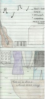
This is the back cover of the CD cover, also in draft form. It’s shows a guitar and a drum that “Two in a Boat” use which represents the band without them in the photograph. These instruments give an idea about the genre of the music which is indie acoustic. It also has music notes coming from the guitar which then leads into the list of songs on the album, one being Ain't That Easy, like bullet points.


This is the draft front cover of our CD album. It shows the corner or section of a boat which has the name "Two in a Boat" and the name of the song written on the boat like it's the name of it. It also has a close-up of Olly and the girl holding hands, so that's their faces aren't included which denotes them being together but also has connotations of the "happily ever after" ideology that everyone dreams of. It also shows equality between the sexes and neither is more favoured or publicised. The colours of their clothes will be decided at a later date but these will also be thought about, due to the representations these may give.

Friday, October 08, 2010

Questionnaire Results ★

These are the results of our questionnaire that we gave out to people of our target audience and people who frequently watch music videos to get a wide range of responses.

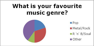
The first question asks "what is your favourite music genre?" with the answers "Pop", "Metal/Rock", "R 'n' B/Soul" and "Other". The biggest section of answers came from the "other" category which included genres of music such as indie, religious, folk and orchestral. Metal/Rock also had a big percentage of the pie chart, as did Pop which influenced our decision about what genre of music to make a video for and we came to the conclusion of indie/pop.


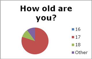
The second question asks "how old are you?" with the replies of "16", "17", "18" and "other" which informed us of the general ages people were and if that reflected their music choice and decisions about our music video idea. The biggest age was 17 with 16 and 18 having the same percentage. I think this age group is the most likely to watch music videos and be inspired by them rather than young teenagers or adults because of the ideology that is associated with such videos.


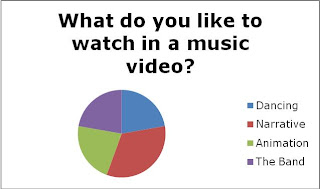
The third chart asks "what do you like to watch in a music video?" with the answers "Dancing", "Narrative", "Animation" and "The Band" which had quite equal responses. In our music video we have a narrative and the band featured which have a large percentage (especially for narrative) in this pie chart and this result influenced our decision.


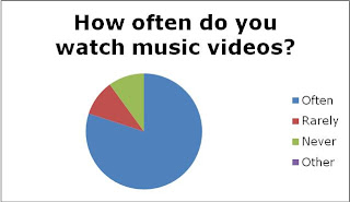
The forth question was "how often do you watch music videos?" with the options "Often", "Rarely", "Never" and "Other". Approximately 80% of people watched music videos often which again, i think is because of the age of the target audience and because of how accessible they are to people of this age.


These were the questions with multiple choice answers which is why they could be made into charts. The other questions required more thought and so we didn't give any choices which is why there are no graphs to show these replies. The responses we got will still be taken into consideration however if/when we adapt our storyboard and film.

Story Boards ★

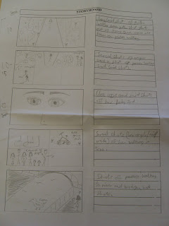
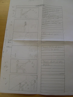
These are our 3 story boards for the music video. They include timings, an image of whats happening in the scene and a brief description by the side of it.


This is the first storyboard which sets the scene of who the characters are whats happening. It shows "the girl" in her room with a torn up picture, receiving a text from her boyfriend and then leaving her house to meet up with him. This will include close-ups of her face and of the text so the audience knows what's happening. It will also have some mid-shots and also footage of Olly playing from the various angles we shot.


This is the second storyboard which leads on from her leaving her house. She is shown walking through a park with focus on other couples that are sat around, making her reflect on her own relationship. The river is also shown as well as close-ups of her face and of her feet. Olly is also shown playing his guitar, his location still unknown.


This is the third storyboard which shows her turning up to the place where her boyfriend is and then walking into the room where he's been playing (clips shown throughout the whole video) as the song ends. This will include a variety of shots and also a match on action when she opens the door of the room and when she walks in. POV angles may also be used to show what she's seeing.

Sunday, October 03, 2010

Take One ★

On Wednesday we started filming! We decided to film Olly in a white room, like our storyboard said, and had him sat on a chair with his guitar. We had two cameras that we could use but only one tape which was an issue. To overcome this problem we filmed Olly singing three times, from different angles with the one camera. We had an eye level mid-shot, a low angle closeup looking up the guitar as Olly played and finally another closeup but this time eye level focusing on Olly.

In the editing room we will then edit these takes into short scenes which are in a montage effect with the different angles and they will then be added in between the other footage as shown in our story board which will be uploaded shortly.

We hope to film some more footage this week or next week as filming over half term isn't going to be possible. Once we have all the filming we need we can then get on with the editing and also concentrate on the CD cover and CD advert.

Thursday, September 30, 2010

Questionnaire ★

We composed a questionnaire to gather information from our target audience about the genres of music videos they watch, what they like to have included in a music video and their comments about our music video idea.

Here are the questions:

1. How old are you? (16, 17, 18, 19, other)

2. What is your favourite music genre?

3. How often do you watch music videos? (Often, Rarely, Never, Other)

4. Which music video is your favourite and why?

5. What do you like to watch in a music video? (Dancing, Narrative, Animation, The Band, Other)

6. Our Idea...
What could be changed or improved?

7. Do you think the idea fits with the indie/alternative genre of our song? Why/why not?

8. What would you expect a music video of this genre to include?

9. Do you notice CD print adverts? If so, where do you see them?

10. What do you like about them? What catches your eye? What do you like to see in CD print advert?

11. What is your favourite CD print advert and why?

12. What is your favourite CD cover and why?

We then gave them out to people we thought would have a diverse range of ideas and are creating graphs and charts to show these results.

Monday, September 27, 2010

Textual Analysis - Milow ★

Milow is a singer-songwriter from Belgium who's career started in 2004. He has three albums out, two of which went Gold in Belgium and the third went Platinum in Germany.

This is the advert for his 2009 tour:


From looking at this advert you can tell that it's from the acoustic genre because of the mellow, toned-down colours which are neutral, relaxed and has connotations of being warm and wholesome just like the genre.
Milow is the background of the advert which is a strong representation that he wants to be known, however having his eye diverted from the camera makes him seem vulnerable and humble which could also connote the genre of music behind the advert.
The lowercase font for the name "milow" has a friendly feel to it rather than if it was in capitals and may also have audience gratification and fans may recognise it. It's in white which makes it stand out from the background but is in a complimentary colour which makes the advert thematic and could link with CD covers or music videos. The background is wood which also connotes nature and simplicity which is also what acoustic music is about.
The table of tour dates is in the natural eye line and is clearly structured, the box above and below fit this layout and include the supporting band at the top and the web address and the production company logo at the bottom.

Thursday, September 23, 2010

Textual Analysis - David Ford CD Advert ★

I found a David Ford CD advert whilst looking for a Plain White T's advert which was incredibly hard to find. I had to settle for this one but I'm sure it will have similar conventions to the Plain White T's as it's of the same or very similar genre.

This advert is very simple and sophisticated which is what appeals to me. It shows the name of the artist "David Ford" very clearly in block capitals in a light green which has connotations of nature, cleanliness and i think this fits with the indie/rock music genre that this advert is promoting. The song title is underneath, also in capitals which makes it clear and has more impact than it would if it was in lowercase.
The release date is the first thing on the advert, a central placement in capital letters is clear and precise, however it's in a small font which does make the artist name stand out even more and the date could be seen as a second thought.

The advert includes a quote from The Sun newspaper saying "Mesmerising. Album of the year" and they also gave it 6 stars, more than the usual 5. This is a good sign for people that aren't fans to see as it may encourage them to buy the album or research more about him.

The close-up image of the guitar is a denotation of the genre of music that's on the CD. The checkered shirt, surf-style bracelet, worn guitar and patch grass all give suggestions about the genre of the music as well. They could indicate a hint of country style music on the CD or they could connote the relaxed, naturalistic sound which David Ford's music has. The image is also in a sepia colour which gives the advert a classic look which country/alternative bands often have, unlike genres like "pop" which are much more vibrant and eye catching. This advert is subtly expressive rather than "in your face". The fact that the rest of the advert is black also shows this as it's a neutral, archetypal colour.

Textual Analysis - Plain White T's CD Cover ★

This is the single of "Hey There Delilah" by the Plain White T's. I chose to analyse this CD cover as it fits the genre of indie/alternative/acoustic and so, our chosen track.


The image shows a stereotypical road in New York City and this is easily identifiable to the audience from the skyscrapers and yellow taxis. It has naturalistic lighting, showing that it's evening in winter which links to the video as it has the same setting. The cover also features a girl, who is also the main character in the video and is presumably "Delilah".
The girl is positioned in the centre of the frame but doesn't stand out as we would expect because of the dark lighting and tall buildings which make her seem small and slightly vulnerable.
The weather is hinted at in the image and this gives an idea of the how the song will make the receiver feel. As it's about two people being separated and both of them being alone in different cities it could also denote how "Delilah" is feeling.

The name of the song is in a central placement and in a big, clear font which is eye catching making it the first thing the receiver sees. The name of the band is underneath and much smaller, making it seem less significant than the name of the song. This is in the same clear font as the song title and by having them in colours such as light yellow and light blue which connote peace, relaxation and happiness this also connotes the genre of music at the same time.

The single cover doesn't have any stickers on it which indicate parental supervision as it isn't needed because of the genre of music and the wholesome content of the song. It also doesn't promote any bonus tracks as it's a single rather than an actual CD, but it also doesn't mention a website which could have been a good fan attraction - unless there's a mention of it on the back cover.

Wednesday, September 15, 2010

Textual Analysis - Plain White T's "Hey There Delilah" Music Video ★

PLAIN WHITE T'S - HEY THERE DELILAH

As a group we decided to analyse the song Hey There Delilah by The Plain White T's because it's the same genre as our chosen track by Two in a Boat and the video was also inspiring to us and we want to create a similar effect with our video.

Screen Shots From The Video:


Our group liked the idea of having two narratives during the main section of the video. We thought about having a spilt screen in two or more frames, on focusing on Olly (the singer in Two in a Boat) sat in a room, alone, playing the guitar and singing and the other half/two sections of the screen follow the journey of a girl through the town, hopping on and off buses and trains after receiving a text from her boyfriend saying 'sorry'. The audience won't really know what she's doing until the end when she walks in the room where Olly's playing and sits down by him. When this happens the two/three frames in the video become one.
Mike, Chelsea and I discussed the fact that it's going to be a challenge synchronising Olly's singing in the video to the actual song but this is a factor that we're willing to take time with to get the best result for our video.
Here is the Plain White T's video of Hey There Delilah:


The lyrics of our song are:
Verse One:
You seem to go on and on, and it's driving me insane,
I don't want to hate you
You leave me no choice, when i hear your voice
And now, you're out to get me

Chorus (x2):
Take whats wrong and make it right,
You've gotta learn some to gain some sometimes,
No it ain't that easy, no it ain't that easy, no it ain't that

Verse Two:

If you listen then maybe you will never listen,
Take some time out, make your mind up now,
But only change if you want to change,
No it ain't that easy, no it ain't that easy to make this change, to make things change

Chorus (x2):

Take what's wrong and make things right,
You've gotta learn some to gain some sometimes,
No it ain't that easy, no it ain't that easy, no it ain't that easy

We thought these lyrics would fit with our story line as it's about a boy who's changing for the better after being a pain to his girlfriend who then journeys to find him whilst he's singing a song about people changing.

Textual Analysis - The Wanted "All Time Low"

This is an Internet advert for the new single All Time Low from The Wanted. The band's signature font has been used for their name and the fact that it's blue rather than black, grey or white makes it stand out against the rest of the advert.
Also, the fact that the "wanted" is in capital letters and "the" isn't makes it seem like a wanted poster and could make them seem desired or sought after.

The title of the single is also in capital letters which makes it bold and eye catching as well as the phrase "out now" which is slightly smaller but still visible however this is slightly less important information so this could be why. It also doesn't promote the CD; it promotes the single on iTunes which is a much more accessible service to the target audience of this band.

The photo of the band is a quite cliche image of a boy band as they're all wearing jackets or complementing colours and they're all relatively good looking, shown from angles that make them look their best. The city background makes them seem very current and upbeat yet still wanting to be ordinary and fit in with everyone else. I think the photo of the band is stereotypical of the genre of music as well because a male band from the rock genre wouldn't be so posed and fresh faced and fashion conscience so because of this i think it's obviously the pop genre. The grey tone to the advert also makes it look contemporary and modern which i think is what the band wants to connote.

Tuesday, September 14, 2010

Textual Analysis - Shakira "Gypsy" Music Video ★

SHAKIRA - GYPSY MUSIC VIDEO

I chose to analyse Shakira's "Gypsy" music video because i think her video is a real representation of her personality and background. I also think she's a great role model as she's very natural and has good influences her fans such as being involved with charities and being true to who you are.

The setting used in Shakira’s music video gypsy is very rural and looks like a desert as the ground is very dry and there is a low sunset which creates a mood. There is also a backdrop of the sky at the start of the video and clips throughout. The video features Shakira as the “gypsy” and Rafael Nadal as the person she’s singing about.


The costumes is the video are very simple for Nadal as he just wears jeans and a t-shirt which represents him as an ordinary guy where as Shakira is seen in a more floaty and ‘gypsy like’ outfit. Near the end of the video she wears a silver/gold dress as she’s dancing and this catches the light of the sun very effectively.

The camera work seems to be quite simple when first watched but when screenshots are taken it is more complicated. At the start the backdrop is used and Shakira is ‘walking’ but not getting any closer to the camera. There are also some close-ups of her here which are straight cuts. She is also often in the centre of the frame but she is also seen to the right as she plays the harmonica.

The song Gypsy by Shakira has a light Latin vibe to it which includes earthy instruments like the banjo, sitar and mandolin. It’s carefree and organic ambiance is relaxing to listen to and is a more unique genre than what’s around most of the time in the charts today.


The lyrics of the song represent Shakira’s life as she travelled around a lot as a child and so that’s where the metaphor of ‘gypsy’ comes from. She also said that ‘gypsies are travellers of life always absorbed in different cultures and learning from them’ and this is quite like her as she grew up in Columbia. There is also a Spanish version of the song as there are with most of her music.

She said that she chose Rafael Nadal to be in the video because they can identify with each other as they were both travelling from a young age and working for their life goal.
There are other camera movements that show the relationship between Shakira and Nadal. For example, at the beginning of the music video there is distance between them however as the video and the song progresses they get closer and have close-ups of their faces together.

Before they are seen to be getting along, Nadal is filmed looking through a wire fence which could symbolise him not getting through to her or the words in the song. He is also the minor character because when Shakira is dancing and singing he’s just sat watching her.

Friday, September 10, 2010

Textual Analysis - Avril Lavigne "Alice" Music Video ★

AVRIL LAVIGNE - "ALICE"

I chose to analyse Avril Lavigne's music video for 'Alice' after seeing the new Tim Burton adaptation of Alice in Wonderland as this song was played in the credits of the film and takes its inspiration from it.

The editing in the video is complex with many jump shots between clips of the film and of Avril Lavigne singing/playing the piano. Near the beginning there is a fade through white from a low camera angle of the rabbit hole to a close-up of her singing.
There are also many transitions and fades in and out and layering of clips. This creates confusion within the audience and links to the Alice in Wonderland plot.

The mise-en-scene is a big part of the Alice in Wonderland film and so this had to be re-created in the music video. Avril takes the place of Alice and is seen running through a wood in a confused manner, often with mushrooms present which have connotations of hallucinations which also links to “wonderland”. There is also a section which shows a caterpillar, and one of these is also used in the film.

Her dress is very fairytale like and is worn when she’s in the forest. The other times she wears a t-shirt which looks like a waistcoat which is to do with the white rabbit. There is a white rabbit in the video but its real, not a substitute person. Avril’s eyes represent the Cheshire cat as they glow like his and there’s a part when her face is shown faintly in the background which then has the Cheshire cat’s face faded on top of it which links the two characters.

The camera work is used in an interesting way which gives different views of the rabbit hole from different people’s perspectives. There’s a point of view shot looking up the rabbit hole when Avril (pretending to be Alice) is lying at the bottom after falling down it. That then changes to a bird’s eye view shot looking down the hole at “Alice” on the floor. There are also lots of close-ups of “Alice” when the camera is spinning which always links back to the film. Lots of the camera shots and angles are canted to create a rushed, mystifying experience for the audience which portrays Alice’s emotions.

There are many clips from the film that introduce the main characters such as The White Queen, the Red Queen and the “fats boys”. Also, parts of the music video have been made to seem like Avril Lavigne was actually there, for example, the part with the Mad Hatter’s Tea Party.

Here is a link for the music video... :)
http://www.youtube.com/watch?v=vyDRbx8nWFg

Textual Analysis - Eliza Doolittle CD Cover ★

ELIZA DOOLITTLE

THE FRONT COVER

The landmarks of London that she’s included on the cover makes her nationality prominent and shows she’s proud to be British. She also mixes the buildings she chose as she picked Stonehenge and the tower of London which are both historical monuments as well as using the Gherkin and the British Telecom tower which are modern. By mixing these generations of buildings she’s also hinting at the style of her music as she mixes the old with the new.

The ideology that is produced by having thundery sky giving out to blue sky is the idea of escapism which can be found in her music and this is also aimed at her target audience of females aged 14 – 30 who have an interest in pop/folk music.

The self named album’s font is original and looks like ‘bubble’ writing which gives a creative, scrapbook effect. It’s also solid black which makes it stand out from the background as she wants to be known.

There are many connotations of summer that come with this album, for example the use of bright, pastel colours. There are also literal denotations that can be seen such as the melting ice cream, Eliza’s outfit and the ‘sky’. The fact that the CD was released in July may have also influenced the design of the cover as it would have appealed to the target audience at the time.
Shows the artist – this could be because she’s a new act and she wants to become widely recognised so uses herself as a selling point for her debut album.

The unedited signature leg from her single “Rollerblades” could produce a link to her other songs that fans would recognise. The version on the single had wheels added to the bottom of the shoe.
She uses some imagery which has a deeper meaning that what’s shown as an image. For example, the cat can be used to show love, harmony and peace or the dice could be used as a metaphor for ‘taking a chance’ or relating it to fate which is quite a desired topic to sing about in albums of this genre.

The use of bright colours and varied textures of objects of the cover could come from her unique fashion style which came from Camden Market, London as well as her choice of music genre. The symbolism used from the paint or nail varnish is an explosion of colour and life, like when you take the lid off a paint pot and it goes everywhere.

She’s made the cover seem symmetrical with everything coming from the centre and working its way out which is also a metaphor for what she wants her music to do.

The old radio is a symbol of her mixing the styles of music, especially in her song ‘Pack Up’ which features a sample of a song from World War Two.
THE BACK COVER

Eliza Doolittle is also featured on the back cover. It shows her from a long shot which gets her whole body in to show her style but can still show her facial expression. She’s looking up at the camera which makes it seem like she’s looking up at you, like you have the power of whether to buy her CD or not. She wants to be seen as new and shy which she does show by having her hands near her face and her legs crossed over each other. She wants to seem almost insecure and yet the font of the song titles indicates otherwise.

The fonts of the song titles are the same as the main name of the album on the front but they’ve been made more unique and different for each song. The title ‘Nobody’ has been written in white with no black outline or definition which makes the word reflect what its saying. This is the same with ‘Missing’ as it has been filled with dots which create the illusion of the word seeming broken up and not quote there which also reflects the name of the song. ‘Back to Front’ has been written with the ‘back’ up the wrong way which is a clever, funky idea which also links to the originality of the album design.

Eliza Doolittle isn’t actually her real name, it’s Eliza Sophie Caird and Eliza Doolittle was simply a pet name used by her parents. This name has links to the character of Eliza Doolittle in My Fair Lady which Eliza Doolittle said she loved because of Audrey Hepburn’s portrayal.

The record label logo is on the back with the name underneath. There is also a paragraph of writing underneath which says about release dates, etc.

There is also a paragraph of information which says about the use of the CD. You can get bonus features such as exclusive songs and downloads when the disk is in a computer. This is a good selling point for the CD as you get things you wouldn’t if you downloaded songs from the Internet. Katy Perry did a similar thing by making her CD smell of candyfloss – something you don’t get with downloads. There could also be a website address on the CD which can keep fans up to date with tour dates, new songs and downloads such as screen savers.

All of the eye catching colours are on the front to draw attention to the CD and make people of the target market interested in the product. The back cover is much less interesting to look at but some paint/nail varnish is in the background, following on from the front. I think this is to keep the theme going but the lack of colour draws attention to the songs and the fonts they’ve been written in and also the image of Eliza herself.

The History of Music Videos ★

MUSIC VIDEOS

The music videos we see on television today seem to be a fairly modern invention, however it all began back in the early 1930's when people would make short films based on music. Many Warner Brothers cartoons were modern interpretations of classical songs which were made around specific songs for new Warner Brothers musical films.

In the 1940's Louis Jordan made short films for his songs which were then spliced together to create a feature film 'Lookout Sister' and these are said to be the ancestors of music videos.

In the 1980's Madonna and Michael Jackson were famed for their use age of music videos as they took inspiration from hit Hollywood films, for example, Madonna's 'Material Girl' which can be linked to 'Diamonds are a Girl's Best Friend' from Gentlemen Prefer Blondes, staring Marilyn Monroe.


As music videos became seemingly popular, music TV channels were created and in Britain in the 1970's, The Top of The Pops was born. In the 1980's - 1990's music videos became mainstream and the U.S had made a 24 hour music channel featuring the likes of Duran Duran, Adam and the Ants, Madonna and Queen.

In the past 10-15 years the Internet has become 'video friendly' and this has caused more artists to produce videos for their songs. This means more directors are needed and so the careers of people such as Mark Romanek and Spike Jonze were born.